Challenge
How might we use Quelle Histoire’s thousands of character illustrations and AR + image recognition technologies to help children learn history while experiencing incredible adventures?
Quelle Histoire asked us to create an application that, like Pokemon Go, would give children the opportunity to freely find and collect Quelle Histoire’s characters in the real world. The end goal is to encourage children to explore the places they visit while learning history.
Before working on the solution, we needed to acquire a better understanding of our users and theoretical knowledge on the following themes:
The insights gathered from the user interviews made us realize that the mechanics of Pokemon Go were not suitable for our target audience.
We created design principles based on the key findings to guide our thinking when designing the solution.
A guided experience delimited in time and space.
Grounded in the real world, the application plays an occasional moderation role.
A playful experience that involves the whole family.
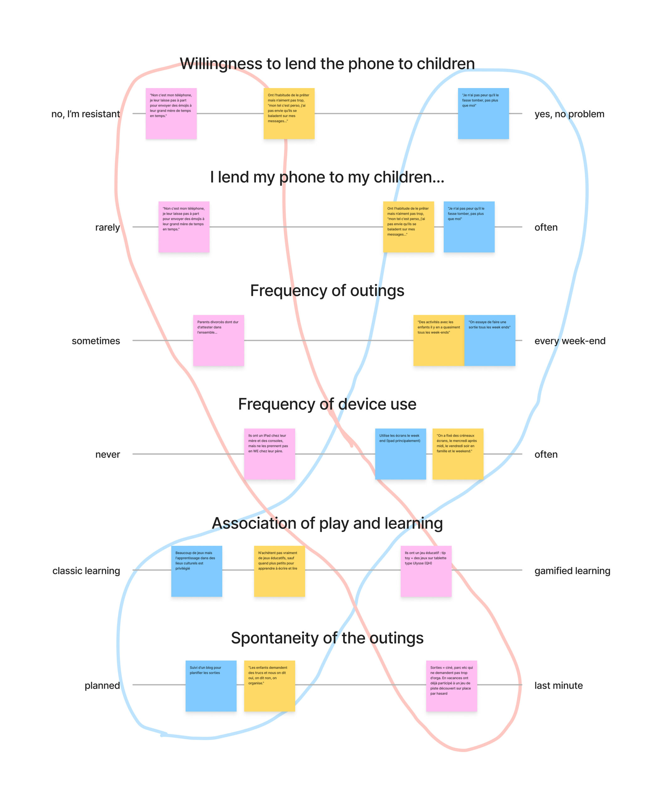
Through the interviews, we identified behavioral variables and distributed the interviewed families on several axes based on these variables. These two similar behavioral patterns gave rise to our personas.
| The spontaneous | The initiators |
|
|
Refining target audience
We found that before age 8, children have not yet developed time references because they have not yet started history in school. They are also still learning to read. To quickly launch the application, we focused on the target with the most potential, families with children aged 8 to 12.
Concept
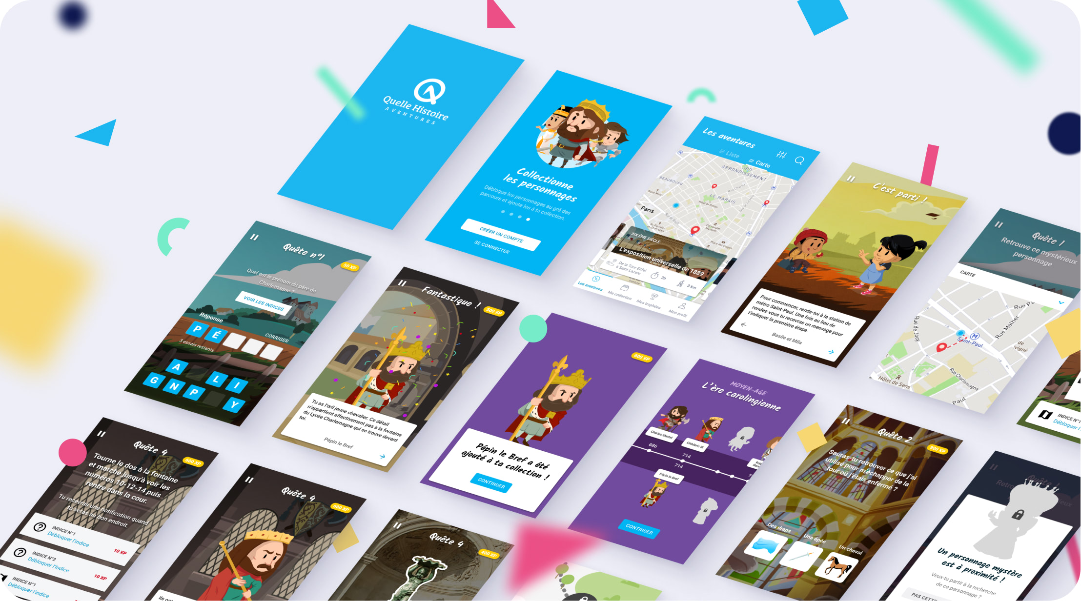
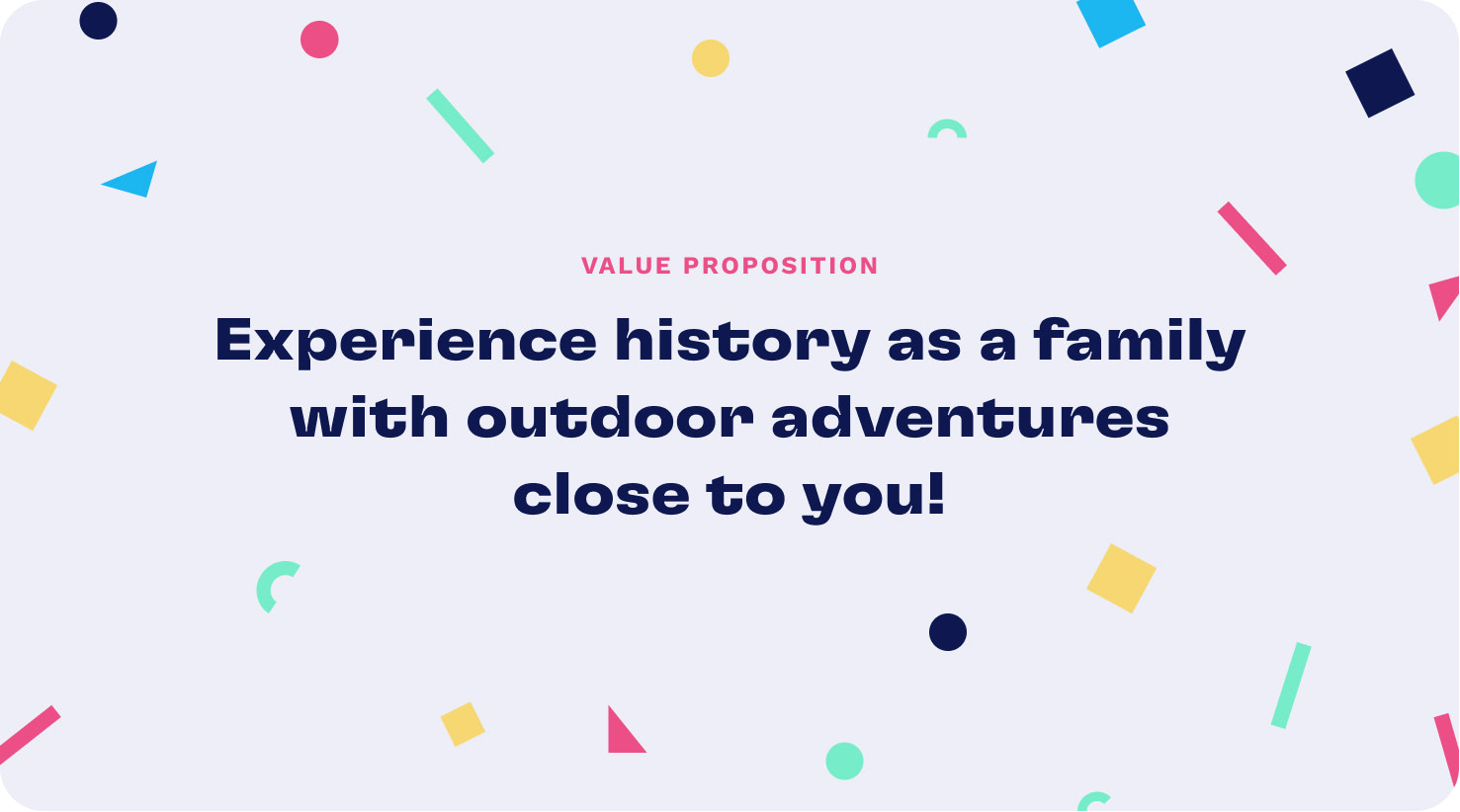
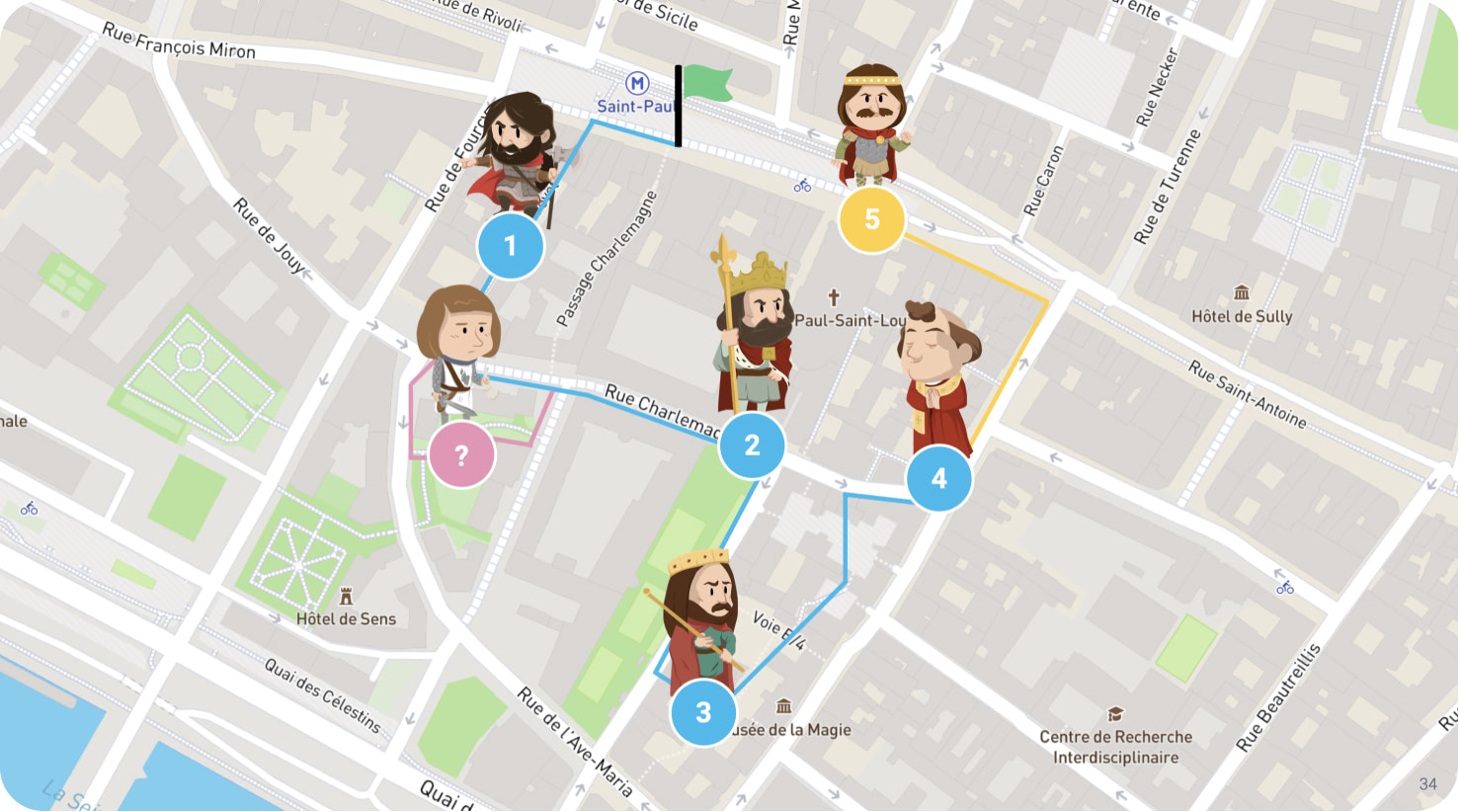
Quelle Histoire Aventures offers families treasure hunts to rediscover their city and learn history in a fun way through an application that combines augmented reality and geolocation. To facilitate children’s learning, the adventures are contextualized, scripted, and several historical events are included to punctuate the experience.
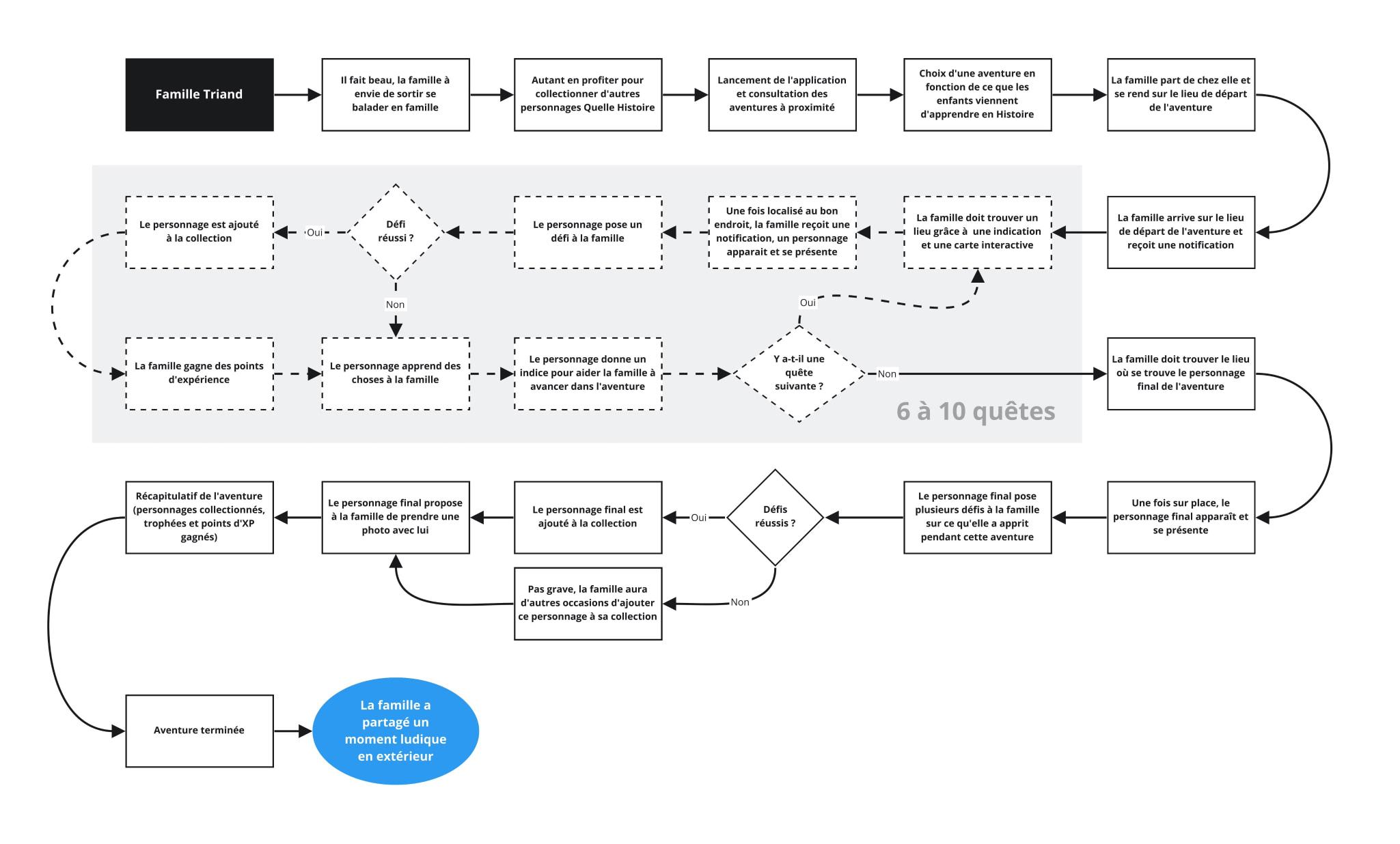
An adventure is composed of 6 to 10 quests. In each quest, a challenge is issued by one of the Quelle Histoire characters. The family collects the character when the challenge is met!
User flows
Ideation
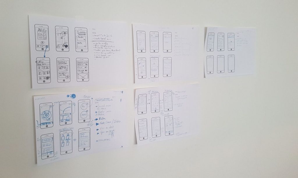
We organized a workshop to quickly explore a lot of UI concepts via the “6 to 1” activity and then converge to a shared vision.
Screens
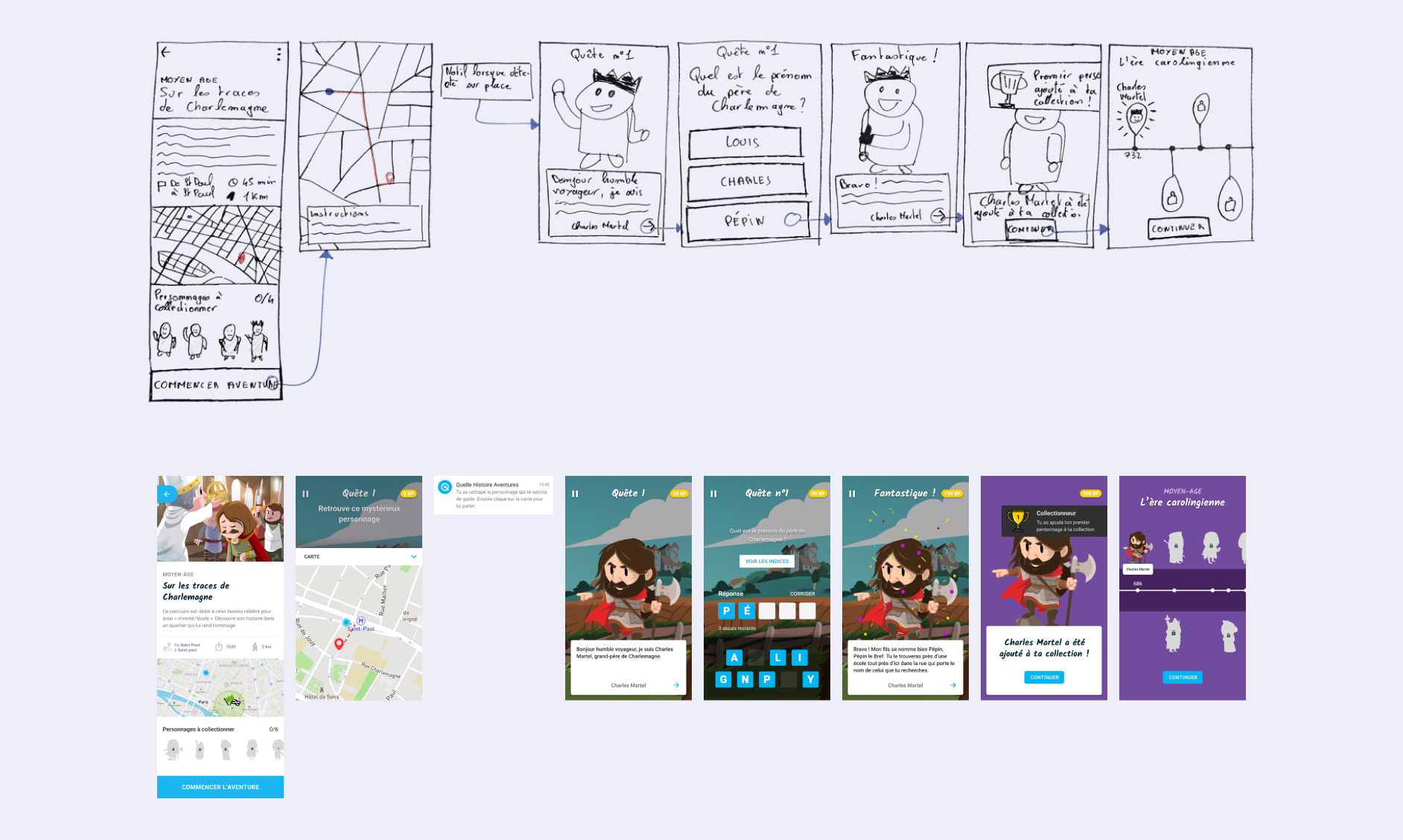
We split up the user flows to design and I worked on the adventure screens. Given the time constraints, we didn’t want to spend a lot of time designing a high-fidelity user interface, our goal was to produce something good enough to allow kids to project themselves and thus gather feedback on the experience.
Before heading into Sketch, I started by thinking about how users could navigate between screens and establish the information architecture using low-fi wireframes.
Concept tests
We wanted to validate the interest of the families as soon as possible. We created an InVision prototype and asked 5 families to experience the adventure we had scripted in real-life situations on the streets of Paris.
|
The challenges were suitable for children who had studied history at school or knew the characters. However, the younger children had some difficulties due to their lack of historical knowledge.
|
Adapt the difficulty of the challenges to the players by giving optional clues to find the right answers.
|

Usability tests
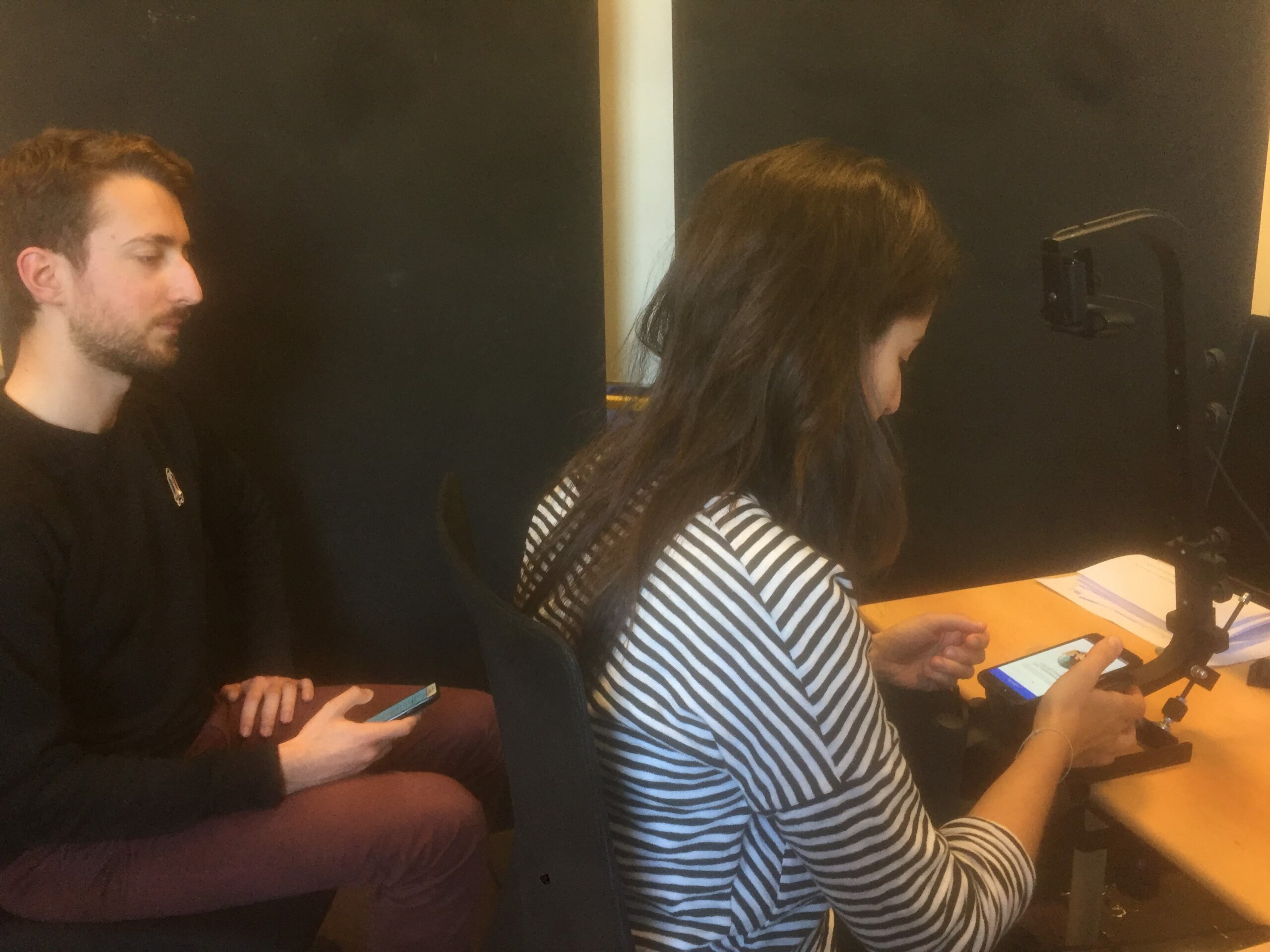
We finally ran usability tests to ensure the application was easy to use. They took place with 5 participants in a laboratory equipped with an eye-tracking device. According to Jakob Nielsen, testing with 5 users is enough to identify 85% of usability issues.
Results
A unique concept for an interactive educational game that appeals to families emerged from this project. The final prototype was used to raise funds to fully design and develop the app, and to convince the first cities and regions to create their outdoor adventures.
The whole team is extremely satisfied of this collaboration with the Gobelins students. The recommendation produced by the team will be used to find the first partners of Quelle Histoire Aventures.

Takeaways
This project demonstrated the importance of investing time in user research to understand their habits and needs. We gained invaluable insights that allowed us to create a unique game that both children and parents enjoy.
It would be interesting to conduct further research, as there may be additional opportunities in the relationship between grandparents and their children.


