
Context and Summary
Physio.me is a service developed by Biogen Digital Health that helps people with neuromuscular diseases follow personalized physical therapy programs from their homes. During my 18-month mission in the Design & Research team, I worked on the mobile app for patients and the web platform for physical therapists (PTs).
Despite high satisfaction, adoption by physical therapists lagged significantly. I led a user-centered redesign of the PT onboarding experience, working closely with a product owner, data scientist, user researcher, and developers. After uncovering the root causes, co-creating the solution, and testing it with users, we delivered an optimized onboarding experience that led to a 47% increase in self-registration conversions and a 78% boost in activations.
Research
Problem
Physical therapists’ adoption and retention were challenging—44% of PTs who signed up never assigned a program to a patient (the platform’s core feature). This has a high impact as it reduces the platform’s overall effectiveness and limits its value to patients.
Constraints in User Research
While our Research Repository provided some insights, it wasn’t comprehensive enough to fully understand the adoption challenges.
Testing the current onboarding experience with users would have been extremely valuable for uncovering pain points and opportunities. Unfortunately, Biogen’s legal compliance process for user communications required several months, which we couldn’t afford to wait for. Creating an in-app survey was also not an option.
To work around this constraint, I connected with the Customer Service team—the closest touchpoint to users—to gather their valuable perspectives on the issues experienced by new users. Key findings include:
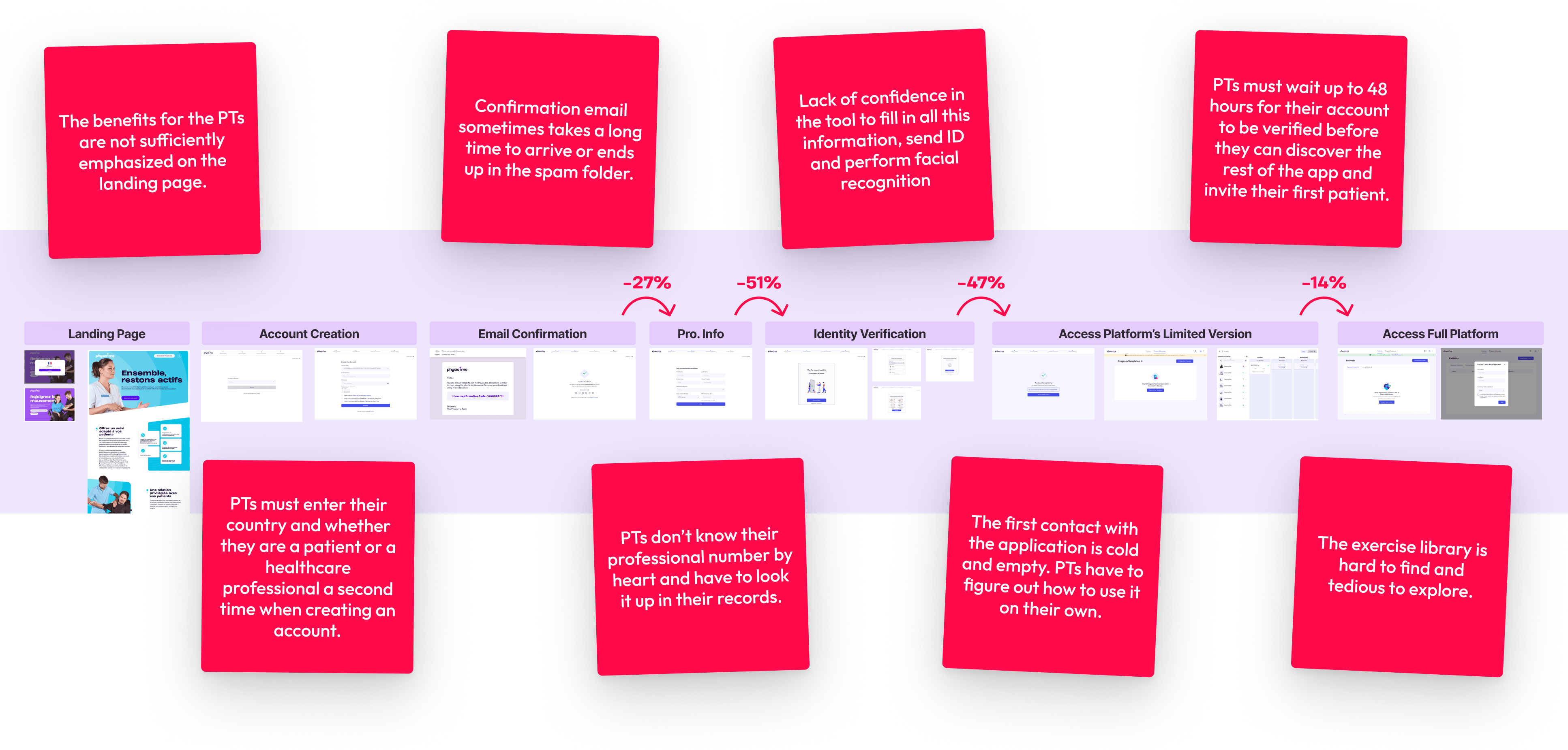
- Lengthy Self-Registration Process: PTs were required to verify their identity as healthcare professionals during signup, resulting in a cumbersome process generating a lot of drop-offs and support requests.
- Lack of Immediate Engagement: After sign-up, PTs had to wait up to 48 hours for their professional status to be verified before they could use the platform.
- Better Onboarding at In-Person Events: PTs who were introduced to Physio.me by Biogen affiliates and who registered through a VIP flow (shorter and without identity verification) had fewer problems using it and becoming active users.
Root Cause Analysis
From our initial findings, we hypothesized the causes of PT inactivity and conducted a root cause analysis. I worked with a data analyst to dig into the usage data, which revealed that the issue was most severe for users signing up via the self-registration flow: Activation rates for self-registered PTs were 56% lower than those invited by Biogen.
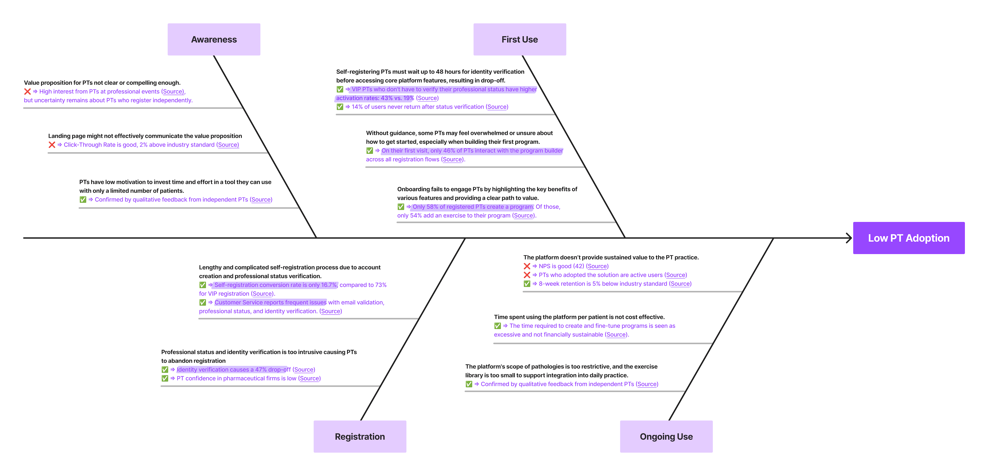
Only 16% of users who began the self-registration process completed it and accessed the platform—a huge missed opportunity! By conducting a UX audit and examining the drop-offs at each step, we identified the key pain points in the self-registration journey.
Ideate & Design
Challenge
Stopping professional status verification wasn’t an option, as Biogen must comply with healthcare security regulations (HIPAA, PGSSI-S). However, there were clear opportunities to improve the self-registration experience.
How might we build trust and optimize the first-time user experience so that PTs realize in less than 5 minutes how Physio.me can transform their practice?
Ideation Workshops
Using the insights from the discovery phase, I organized 4 ideation workshops with a cross-functional team, including engineers, product managers, marketing managers, and designers. We first brainstormed solutions and used the RICE (Reach, Impact, Confidence, Effort) scoring method to make rational prioritization decisions.
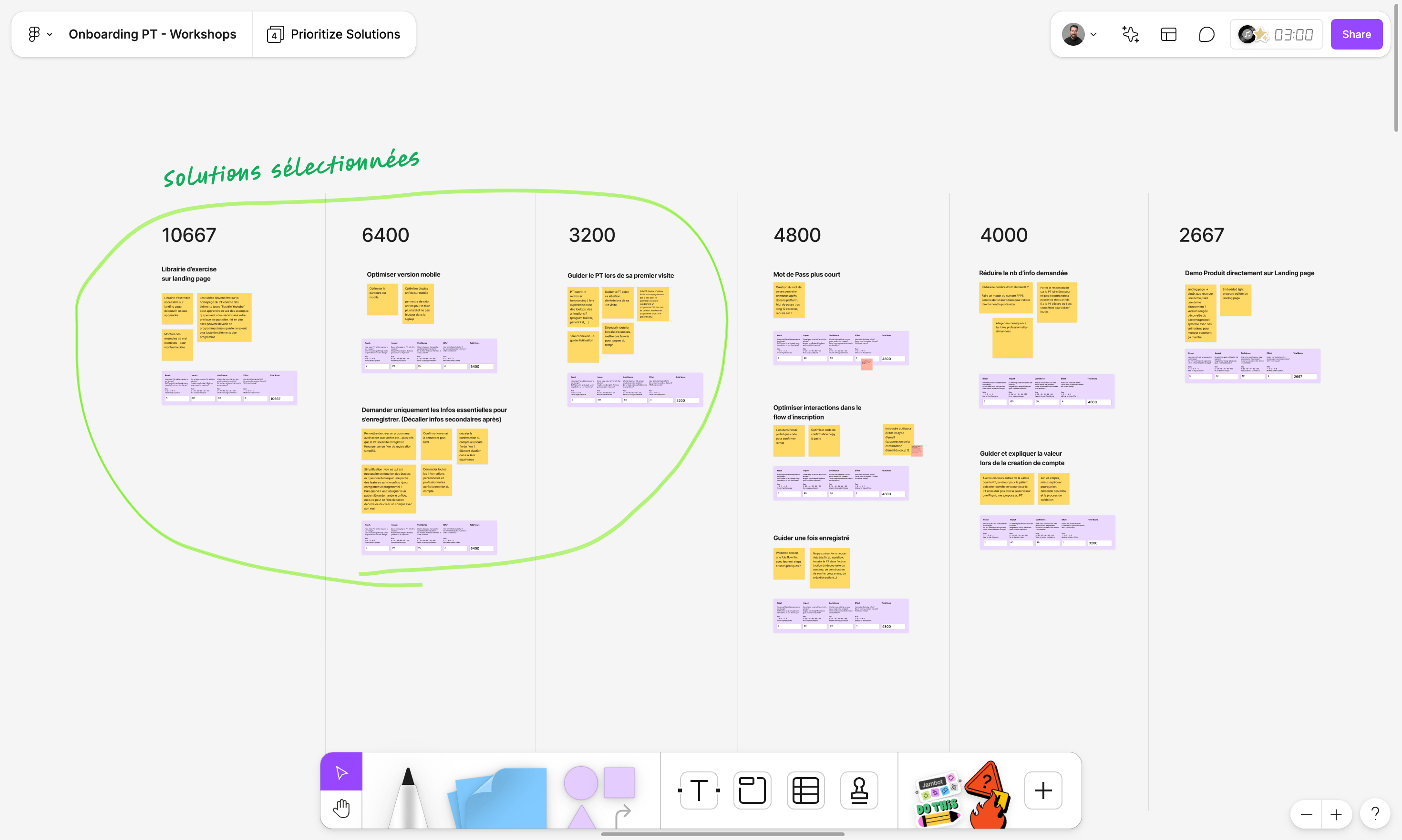
Prioritized Solutions
- Allow PTs to explore the exercise library before signing up
- Verify professional status after PTs have experienced the value proposition
- Guide users in their app discovery
- Optimize the mobile signup experience
Defining Our Vision
We envisioned the ideal experience for PTs to discover Physio.me, free from constraints. This aspirational vision served as a north star for the redesign, enabling the team to think beyond the current status quo.
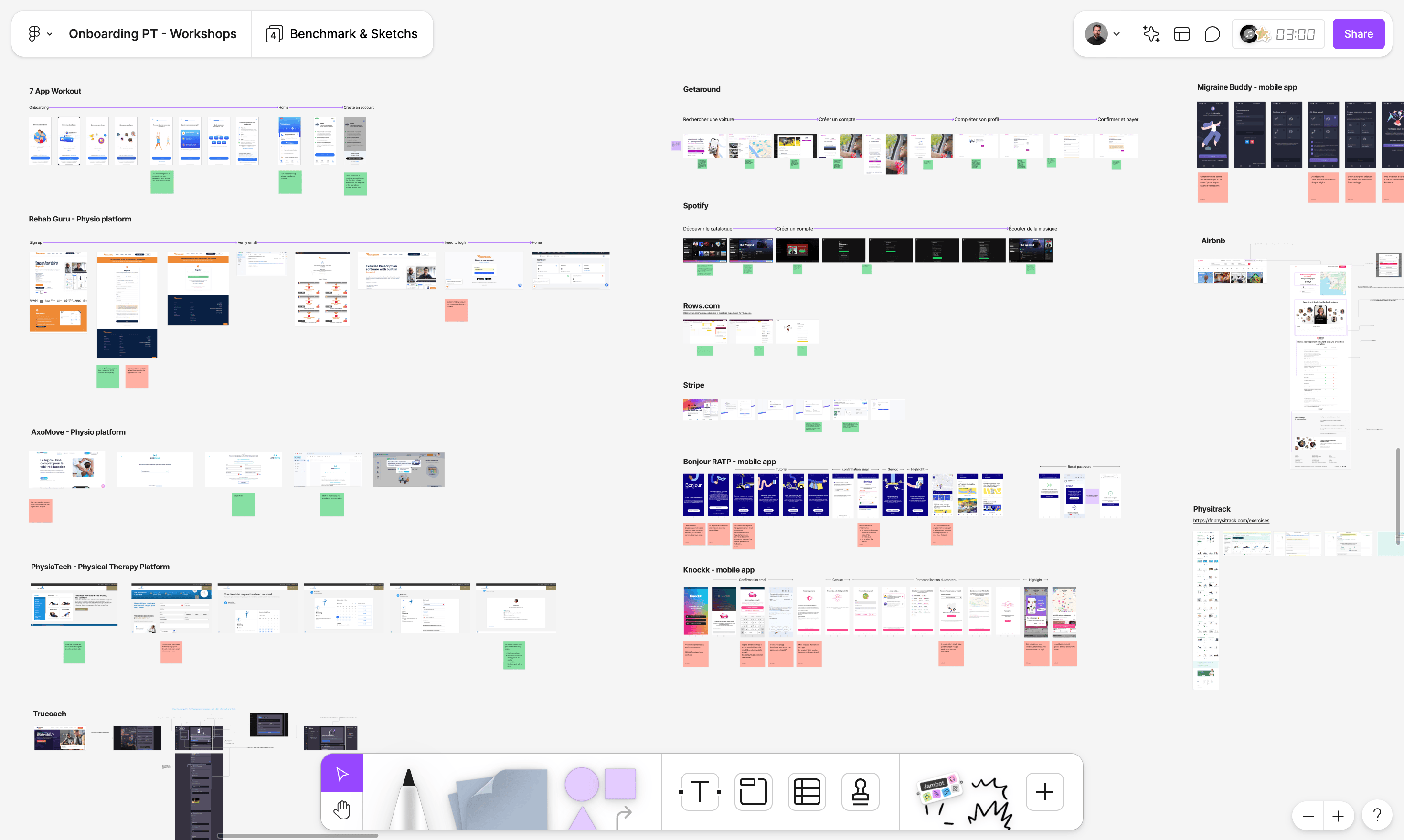
Collective UI Benchmark
To identify best practices and inspire a strong onboarding vision we made a collective UX/UI benchmark of top onboarding experiences with similar challenges.
Ideal Onboarding Flow
I invited the team to imagine an ideal onboarding sequence for PTs, focusing on enabling them to quickly grasp the value proposition and start using the product with ease.
To achieve this, we created User Test Flows using six post-its to outline the key actions PTs would take to explore the product and achieve their goals. This exercise, a precursor to storyboarding, helped us focus on the essential steps and keep the onboarding flow concise.
During a dot voting session, it became clear that team members had differing visions for the ideal onboarding experience. I facilitated a discussion to address these differences, leading us to a consensus on the ideal user journey.
This action sequence significantly improves the current onboarding experience, but allowing users to access the platform anonymously raised several technical and legal issues.
Addressing Constraints
We now needed to turn the ideal user journey into a realistic one by reintroducing constraints. To do this, I conducted stakeholder interviews with tech, legal, and data privacy teams to clarify and fully understand the origins and reasons behind each constraint.
I discovered that some constraints made the user experience unnecessarily complex. For instance, asking for facial recognition was not legally required but had been included “just in case”. I successfully challenged this by highlighting the concrete impact of such self-imposed constraints on user experience and business KPIs.
To prepare for the next workshop, I mapped each constraint in a simple, visual format. This allowed me to clearly communicate opportunities for simplification to the team and inspire reflection on how to balance constraints with user needs.
Designing a Realistic User Journey
With the ideal flow in mind and the constraints clarified, we moved on to a storyboarding workshop to define the optimal onboarding flow. Each participant individually sketched the key screens for the main stages of the journey.

We then collaborated to merge the best ideas and create a realistic user journey that we could all agree on. One compromise we made to improve the feasibility and mitigate legal risks was maintaining a quick account creation before gaining access to the platform.
Solution
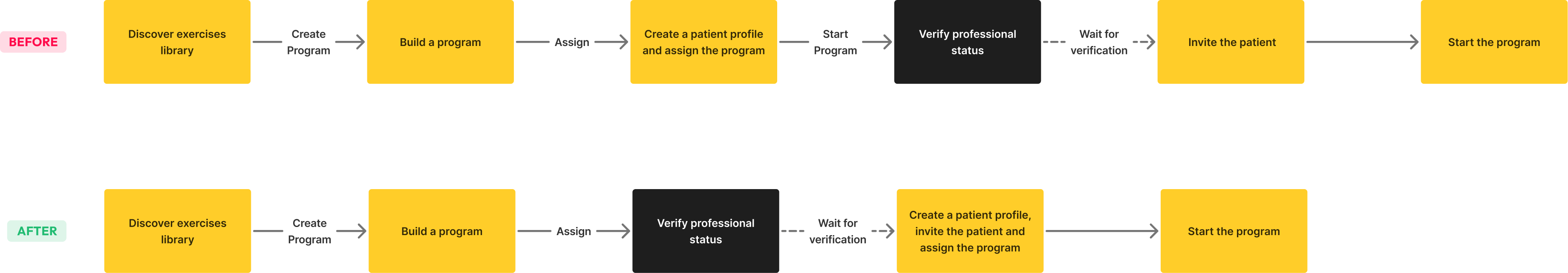
The new onboarding experience streamlines access to Physio.me by allowing PTs to create an account with just an email and password. They are then welcomed and guided to key actions, such as exploring the exercise library via a dedicated page, creating their first program with guided steps, and assigning it to a patient—all before verifying their professional status, which is only required when inviting a patient.
We split the implementation into two iterations to ensure smooth delivery and quickly address key pain points while ensuring that high-value features were user-tested before launch.
Iteration 1
Remove blockers
- Remove unnecessary fields and actions in self-registration.
- Defer identity verification until PTs invite their first patient.
- Explain the need to check professional status.
- Remove unnecessary facial recognition.
Iteration 2
Encourage activation
- Guide new users to key actions with a “Get Started” screen.
- Create a dedicated page for exploring the exercises library.
- Provide guided interactions for creating a first program.
- Improve empty states.
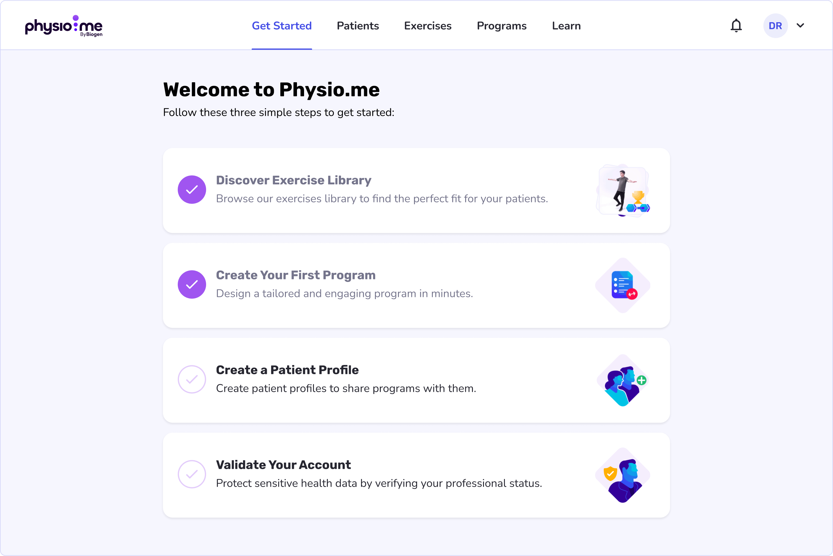
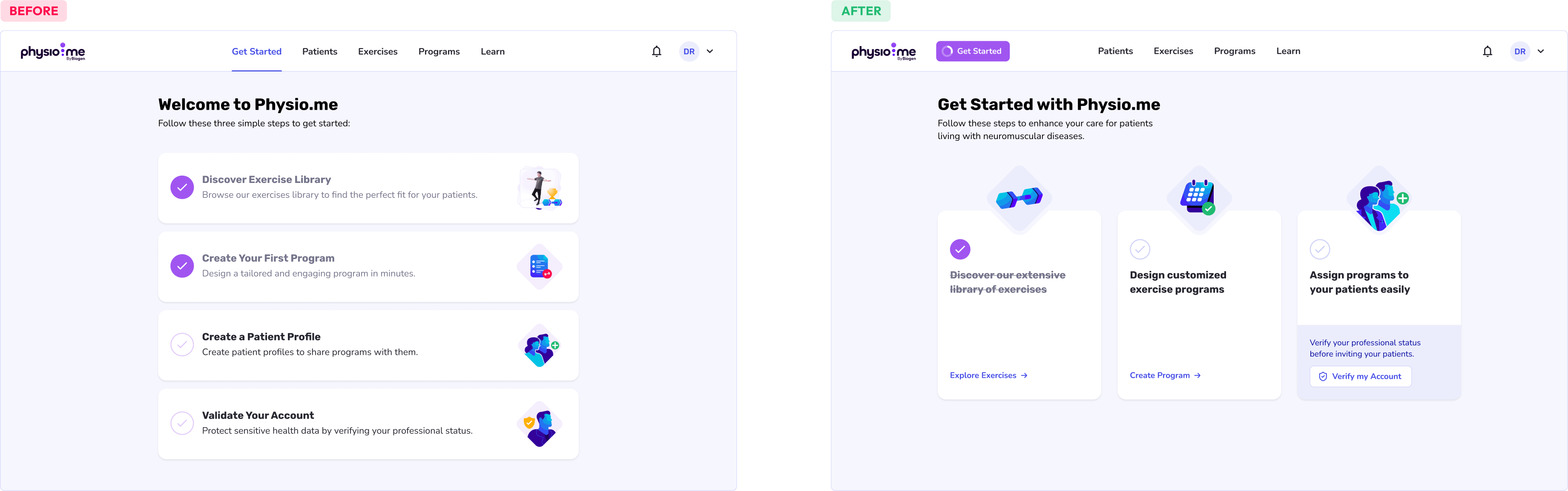
Designing a Flexible “Get Started” Experience
The “Get Started” page introduces new users to Physio.me, highlighting its value and guiding them toward key actions for effective onboarding and early engagement.
To account for diverse entry scenarios (self or VIP registration, patient or referral invites), I prioritized flexibility by allowing PTs to choose their starting point instead of following a rigid path. I introduced a checklist concept to encourage progress and motivate users to complete key actions (Zeigarnik Effect).
The actions are ordered to follow the golden path for optimal app discovery, helping users quickly reach their Aha! Moment.
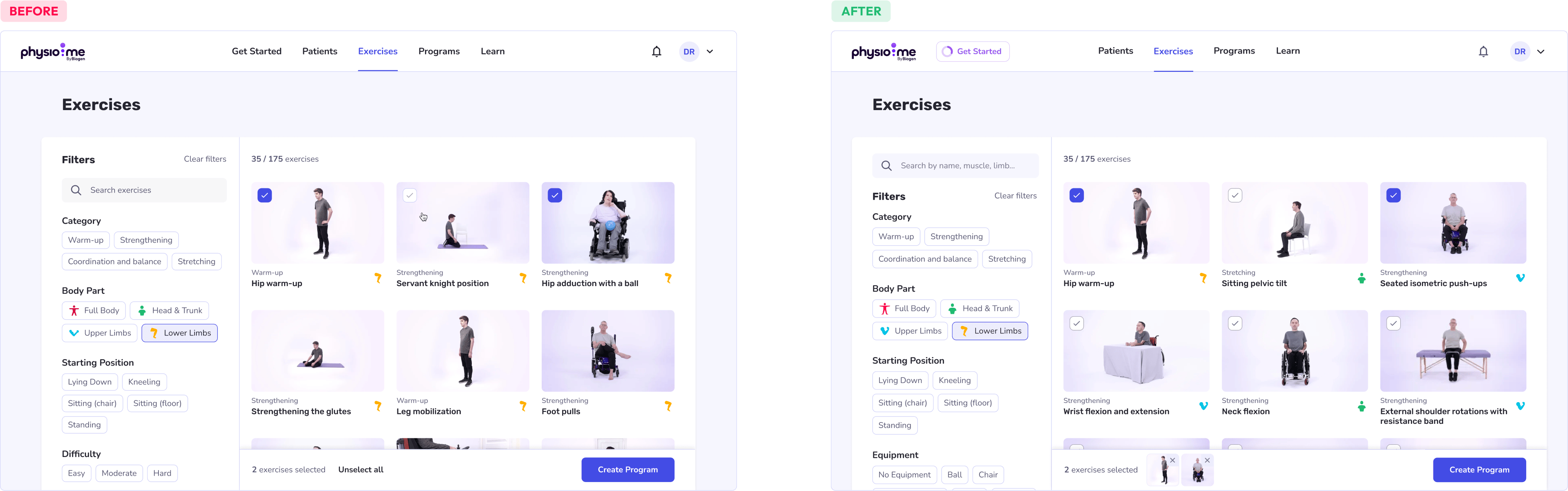
Creating a Dedicated Page for the Exercise Library
The exercise library, a key part of Physio.me’s value proposition, was previously tucked away within the Program Builder and not prominently featured.
Our research showed that new PTs spend significant time exploring the library, browsing an average of 27 exercises during their first session. However, the current design was not well-suited for this task:
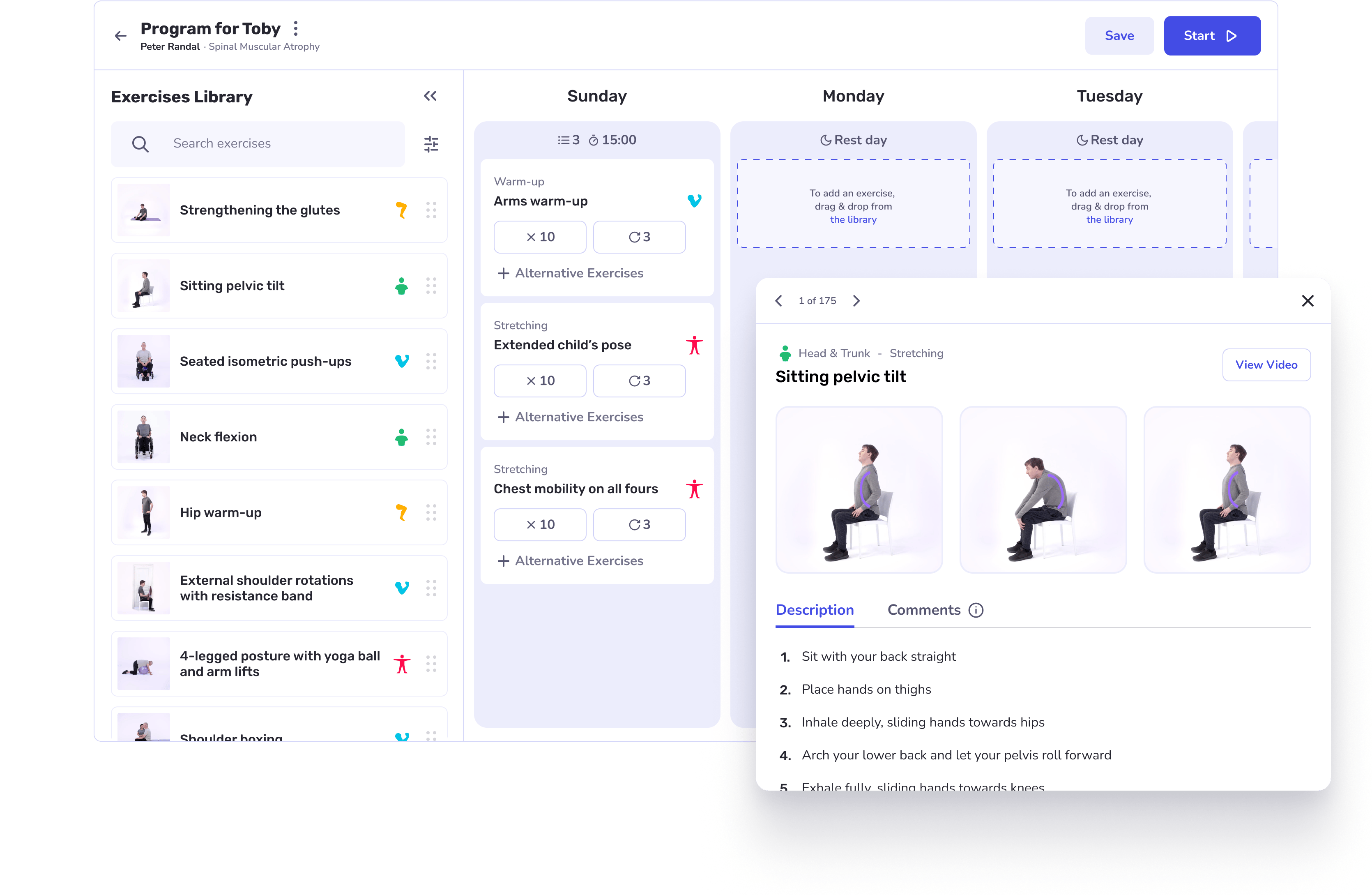
I experimented with different page layouts and mechanisms to facilitate exercise discovery and ensure a seamless transition to program creation. Ultimately, I opted for a full-page design that prominently displays exercise thumbnails, allowing PTs to make a selection of exercises and create a new program.

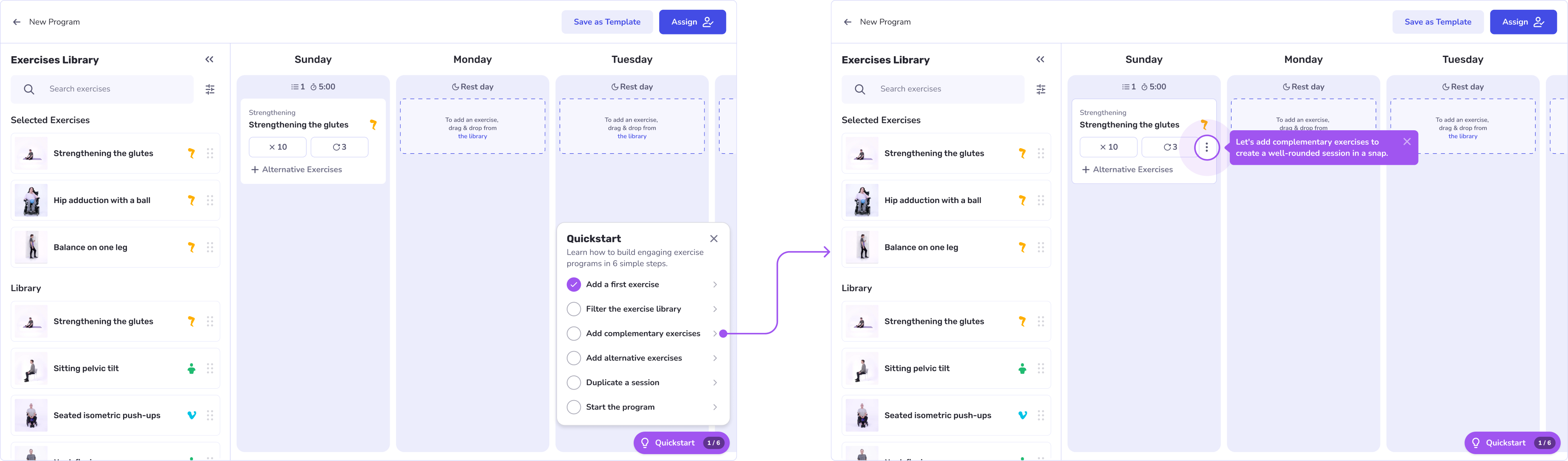
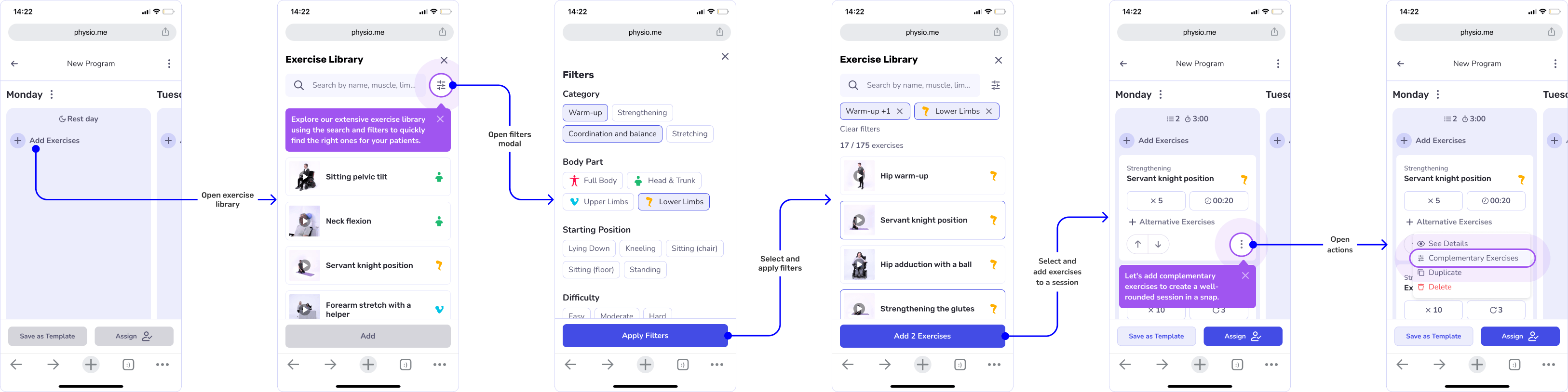
Guiding Interactions in the Program Builder
When they arrive in the Program Builder, PTs see the exercises they previously selected on the new Exercise Page, conveniently located at the top of the library. They can then drag and drop these exercises into sessions to design their first program.
By reusing existing mechanics, I minimized the development effort needed to implement this new workflow while maintaining a consistent user experience.
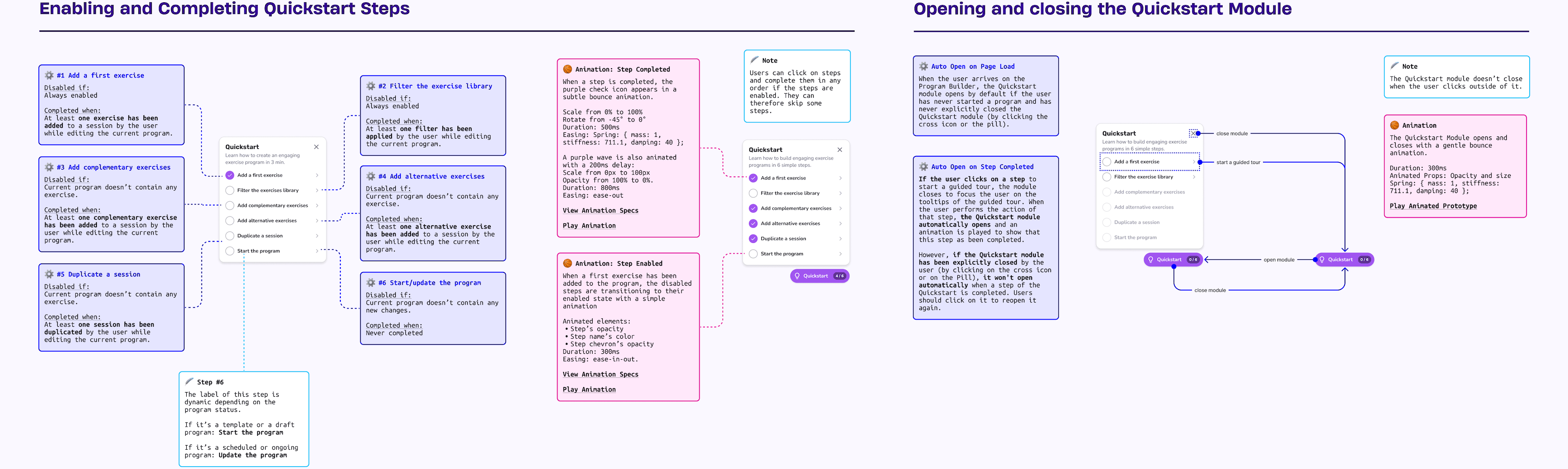
To support less experienced users, I designed a Quickstart module that guides them through the main features of the Program Builder, making it easy for them to get started.
The application is mainly used on desktops, but mobile usage remains important, so I ensured the solution was fully responsive. On mobile devices, the Quickstart module is replaced with contextual tooltips and hotspots to guide users through advanced features.
Prototype & Test
I built a high-fidelity Figma prototype to test the solution with 8 physical therapists. By utilizing Figma Variables, I created a highly flexible prototype that closely mimicked a real onboarding experience. This enabled me to observe user behavior, assess their understanding of the app’s value, and evaluate their ability to navigate independently.
User testing showed that physical therapists can now easily complete key actions and have a clear understanding of the benefits of using Physio.me. These sessions also provided valuable insights for further refinement.
“It gave me a clear, step-by-step introduction to how Physio.me works. I feel confident using it right away!”
Addressing Key Design Issues
Uncertainty About Patient Access
Allowing PTs to create a patient profile before verifying their professional status confused whether patients could access their programs at this stage (they couldn’t).
Design solution: Simplify the flow by letting users create programs but only allowing them to assign programs to patients after professional status verification.
Misinterpretation of the “Get Started” Page
Some users mistook the “Get Started” page for a permanent menu rather than a temporary checklist of actions to complete.
Design solution: Differentiate the page from other tabs to highlight its temporary nature and visually emphasize it as a list of actions to complete.
Exercise Selection Visibility
PTs appreciated the new exercise library page but found the exercise selection function hard to notice, as it only appeared on mouse-over.
Design solution: Always display the selection function on exercise cards with increased contrast and include a summary of selected exercises.
Deliver
After refining user flows and mockups based on test feedback, I created detailed design specifications covering every flow and edge case to ensure clarity about the expected behavior. I collaborated closely with the engineering team, hosting weekly design critiques to gather their feedback and ensure the solution was feasible.

Results
Redesigning the onboarding experience led to significant improvements in activation metrics, with a 47% increase in self-registration conversion rates and a 78% boost in first-session activations. However, it is still too early to measure the full impact on adoption and long-term retention.
“In a year of working with Rémy, I felt confident at every stage of our discussions, projects, and his constructive relationships with other team members. All his projects received positive feedback, both internally and regarding the OKRs and metrics we implemented.”

Lessons Learned
- Investigate Root Causes: A thorough, data-driven discovery phase ensured that we tackled the most critical issues behind low adoption.
- Challenge Constraints: Digging into the “why” behind constraints unlocked opportunities for simplification.
- Iterate Quickly: Splitting the solution into phases allowed us to deliver value faster while giving us time to test the most important features with users.
Looking Ahead
This project highlighted opportunities to further drive Physio.me adoption among PTs, such as integrating peer-created templates or AI to streamline program creation, and providing reliable educational content to better support PTs in caring for patients with neuromuscular disorders. Going forward, we’ll continue to improve the value proposition, streamline onboarding, and make it seamless to integrate Physio.me into PT workflows.
Interested in optimizing your product’s user experience? Let’s talk!
